
Rootkers / Our own creative world
Our own identity in motion: a bold yellow signature, a grounded green, and a mark made to travel from screen to street.
Recognition, everywhere
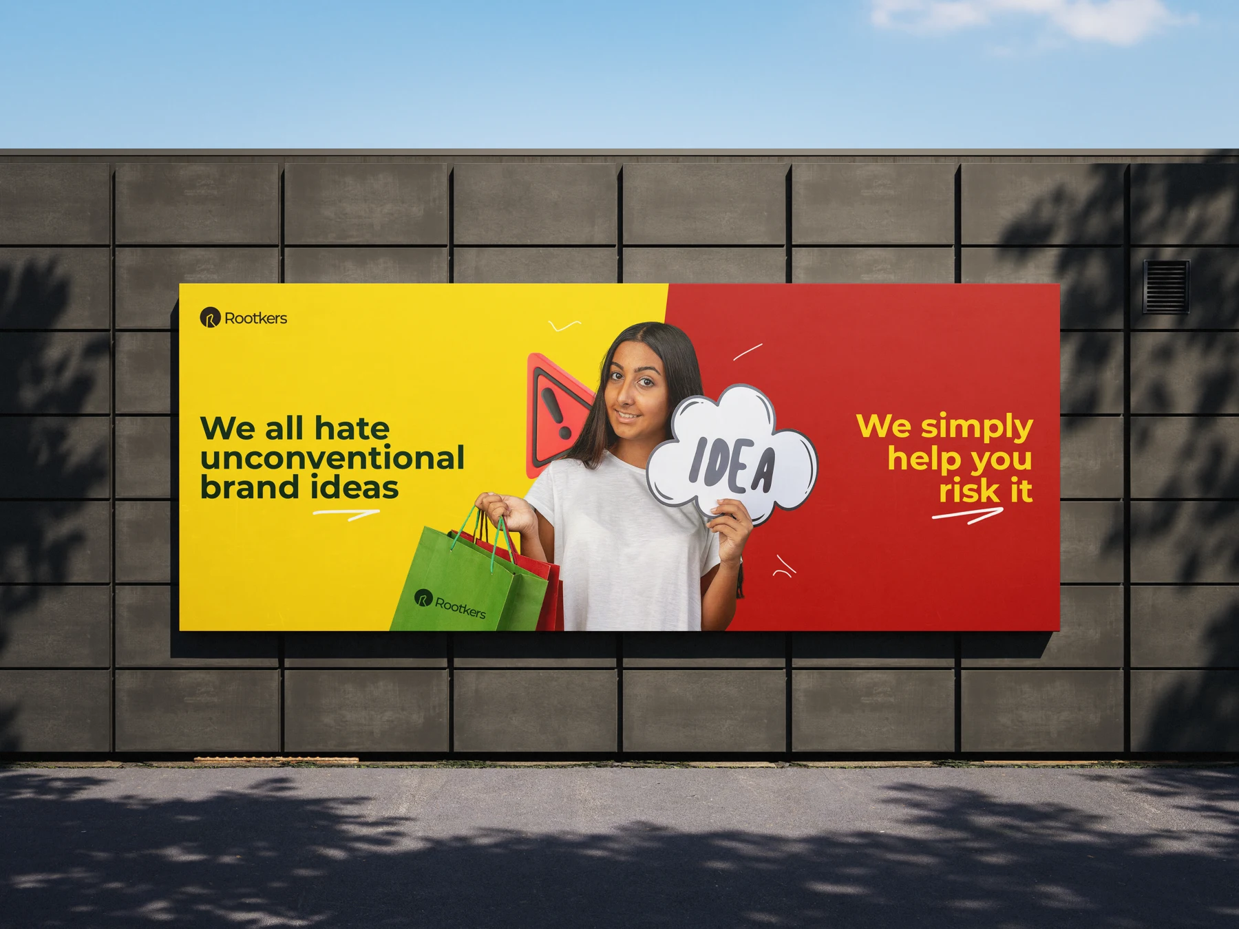
The Rootkers identity gives our creative house a consistent point of view. A distinctive mark and deliberate colour system hold the brand together across very different applications.
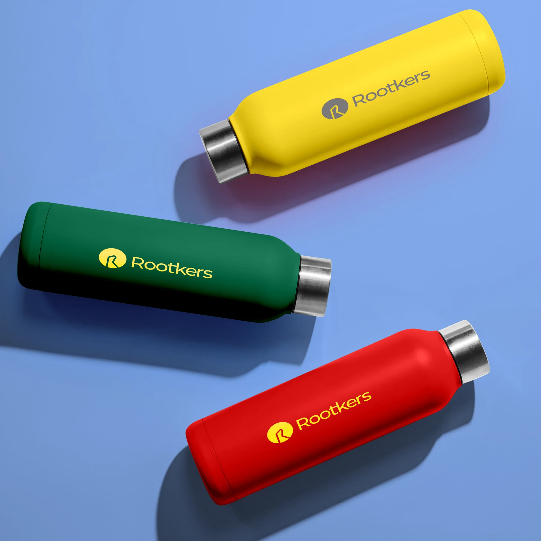
From a billboard to a bottle, the identity stays recognisable. The system leaves room for expressive campaigns while keeping every touchpoint connected to the same brand.
Rooted in thought. Made with heart.
Rootkers is inspired by being deeply rooted in thoughts, creativity and heart. That belief is the foundation of the name and the way the studio approaches work: understand the idea beneath the surface before giving it a visible form.
The human problem
A creative company needs its own point of view, while leaving enough room for very different client stories. Its identity must be expressive without making the work difficult to understand.
The identity logic
The circular R mark supplies a compact signature. Deep green gives the identity a grounded foundation; yellow brings energy and recognition. Repeating the mark through pattern, merchandise and campaign assets makes the system useful beyond the website.
The digital direction
The website introduces the offer, lets the projects provide evidence, and gives visitors a clear route to a conversation. Glass surfaces and responsive motion express experimentation, while straightforward copy keeps the business understandable.
A clear path through the idea.
A simplified explanation of the design logic—not an original production wireframe.
- 01
Understand what we do
- 02
See the thinking in our work
- 03
Find the right support
- 04
Bring us your idea
Where the work begins.
A collection of creative capabilities needed one story and a consistent place to live.
What the work brings together.
The identity and website connect strategy, branding, digital work and physical applications under The Creative Brand Company.
What success should look like.
These are the signals worth tracking. Verified before-and-after performance figures are not available for this case study.
- Qualified project enquiries
- Case-study engagement
- Pricing-to-conversation progression
something you.
Tell us what’s not working—or what you want to bring to life.
Bring it here.