
OBOHSA Orphanage Home
A considered website for OBOHSA Orphanage Home, bringing its story, care and community into one welcoming digital home.
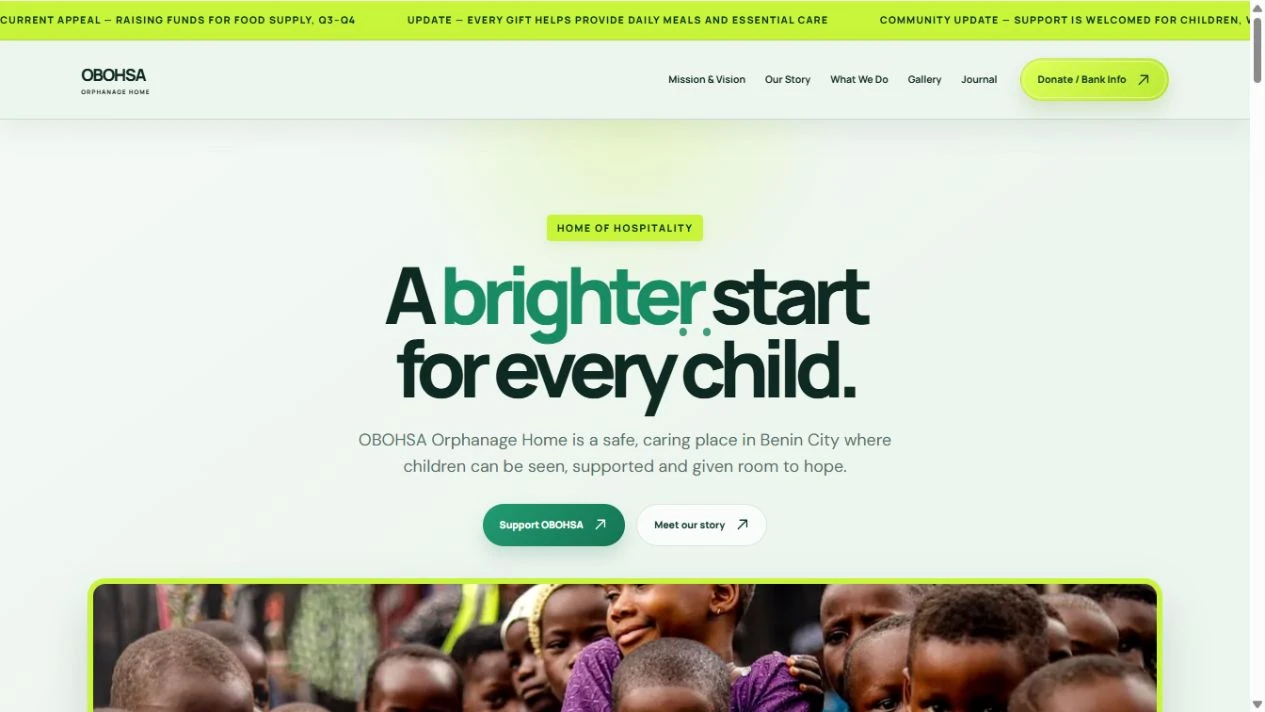
Clarity, care and connection
For an organisation centred on people, the experience needs to feel personal from the first visit. We brought its mission, programmes and ways to get involved into a clear, approachable website.
The design balances warm imagery with readable information and direct routes to the organisation’s work. A connected page structure gives visitors room to understand the story before taking their next step.
Make care easier to understand—and support.
The central idea is a digital home for a human mission. The organisation’s name stays prominent so that every page feels connected to OBOHSA and the children and community it serves.
The human problem
A first-time visitor may care deeply but still need to understand the organisation, what it does and how to reach it. Unclear information creates distance at the exact moment someone wants to help.
The identity logic
The identity is treated as an anchor rather than decoration. Clear headings, readable text and consistent page patterns give the mission priority. Photography and the organisation’s own story carry the emotional weight.
The digital direction
The information structure moves from purpose to context to action. The design rationale is simple: explain the mission, make the work understandable and keep contact routes easy to find.
A clear path through the idea.
A simplified explanation of the design logic—not an original production wireframe.
- 01
Meet OBOHSA
- 02
Understand the mission
- 03
Explore the work
- 04
Find a way to help
Where the work begins.
An organisation’s activities and contact information can feel disconnected when they lack one clear home.
What the work brings together.
The website brings the introduction, mission and routes to support into one coherent experience.
What success should look like.
These are the signals worth tracking. Verified before-and-after performance figures are not available for this case study.
- Engagement with mission content
- Visits to contact or support information
- Completed support enquiries
something you.
Tell us what’s not working—or what you want to bring to life.
Bring it here.