
Cheqa.ng
Brand identity and marketing creative for a fashion idea with its own unmistakable visual language. Creative complete; founder activation pending.
A brand ready to wear its own identity
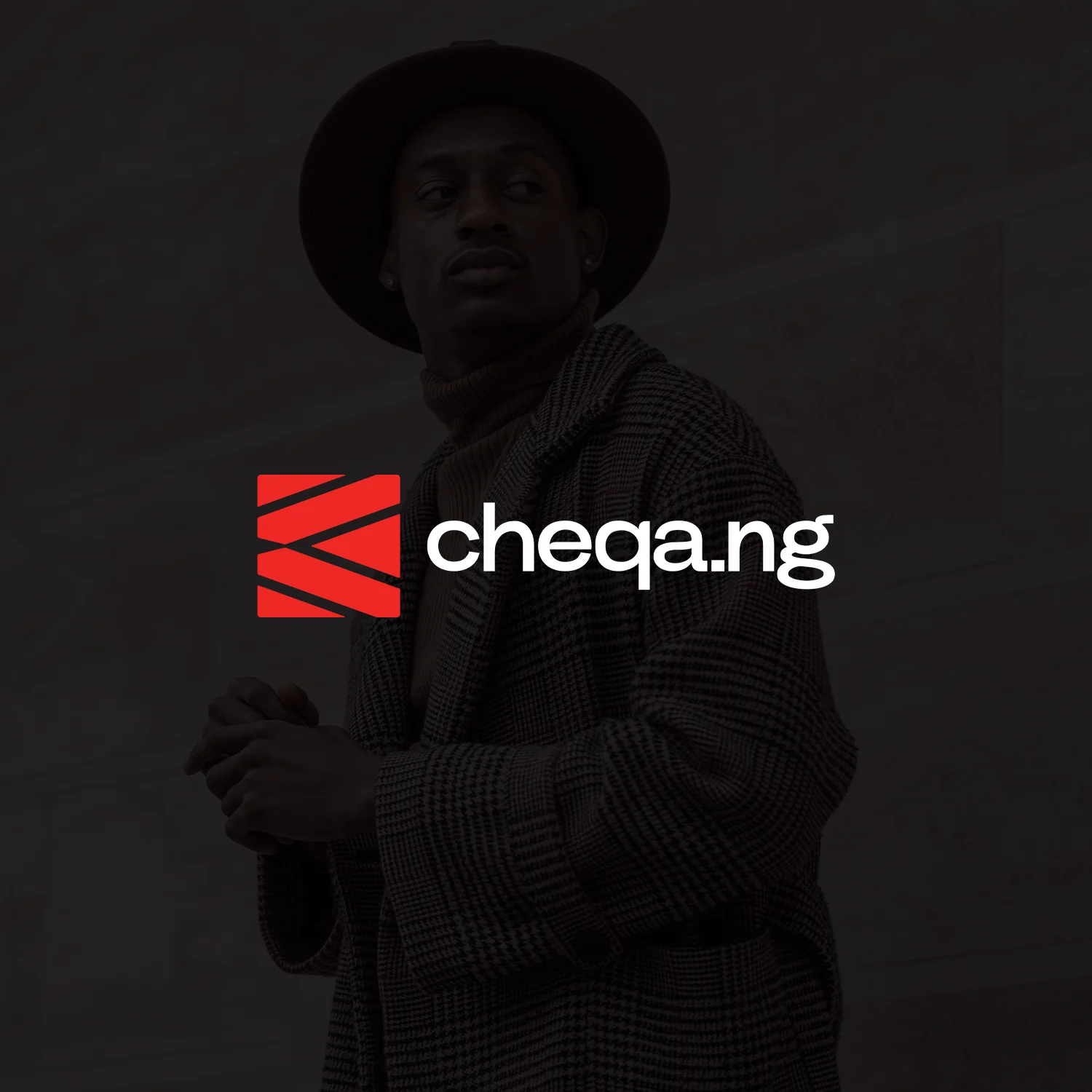
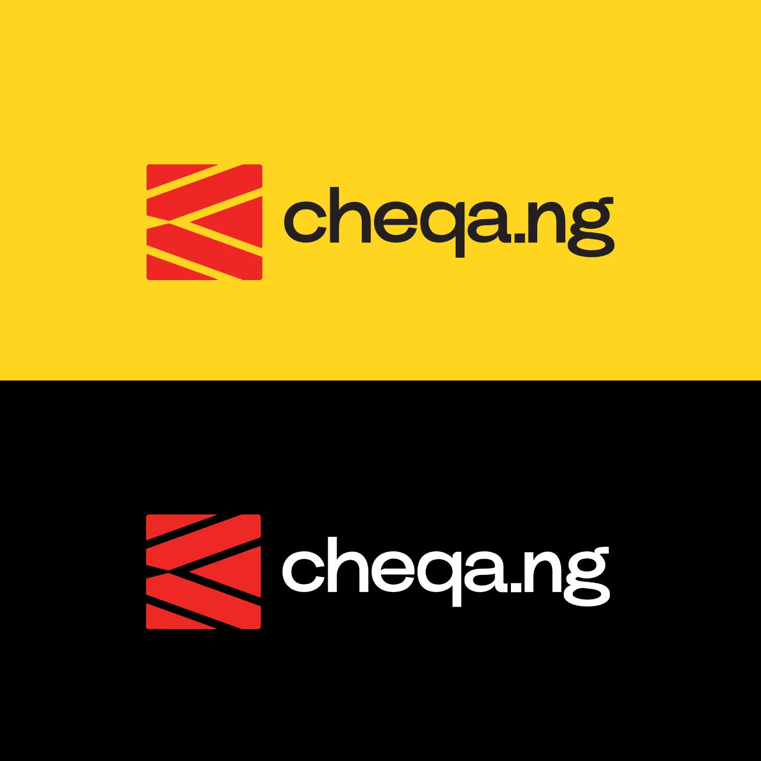
Cheqa.ng needed a visual identity that could travel across fashion, packaging and promotion. We developed a recognisable mark and a bold system of colour, pattern and typography.
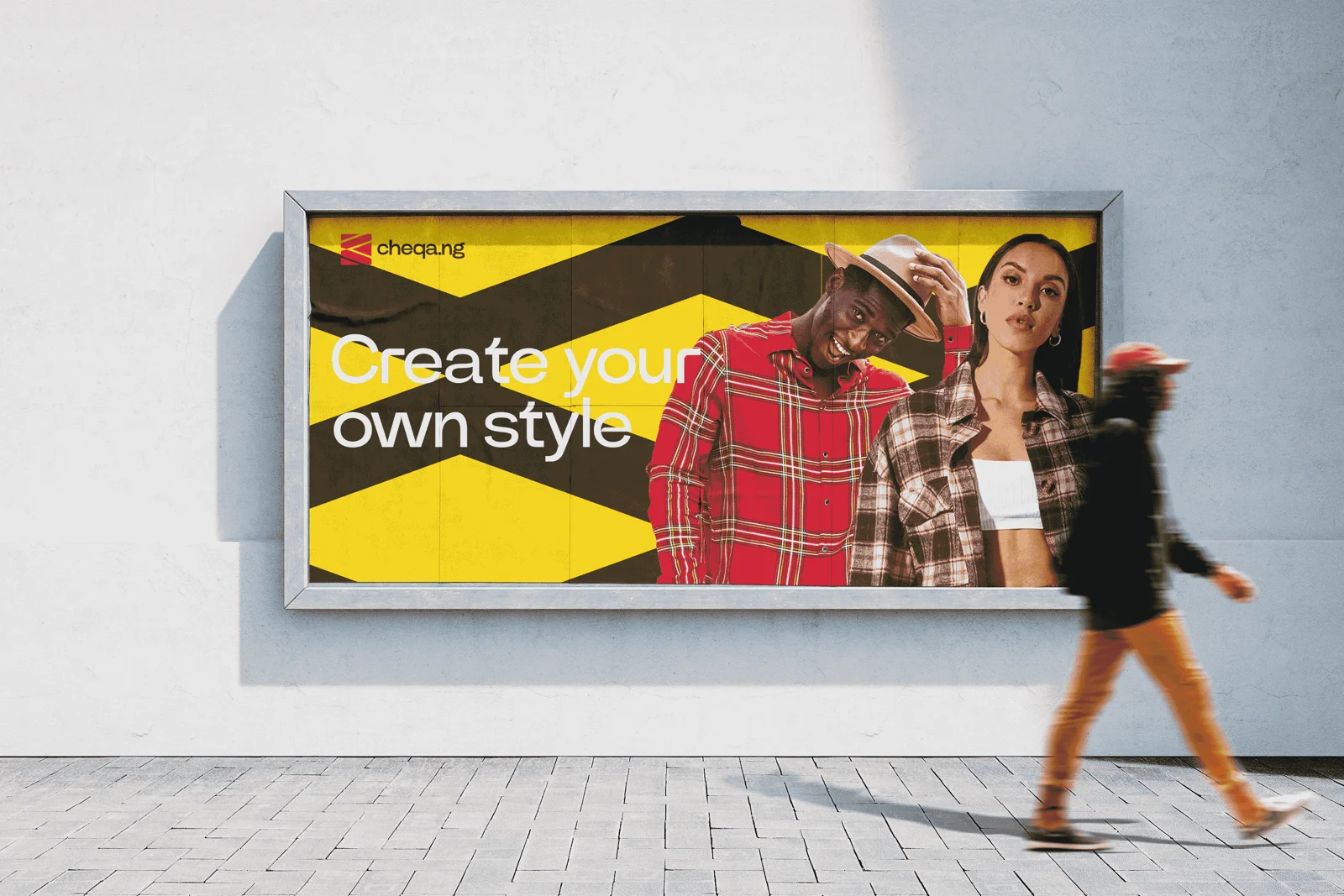
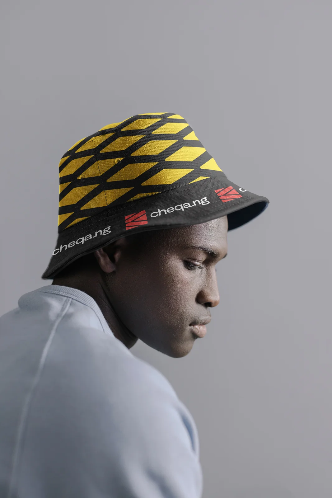
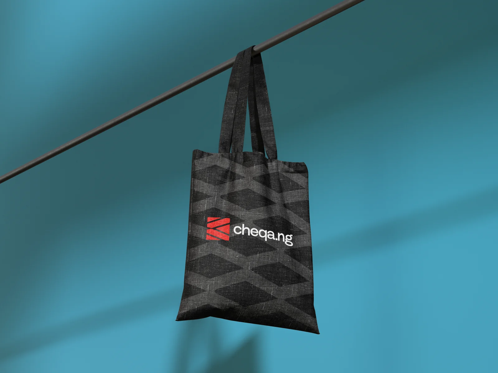
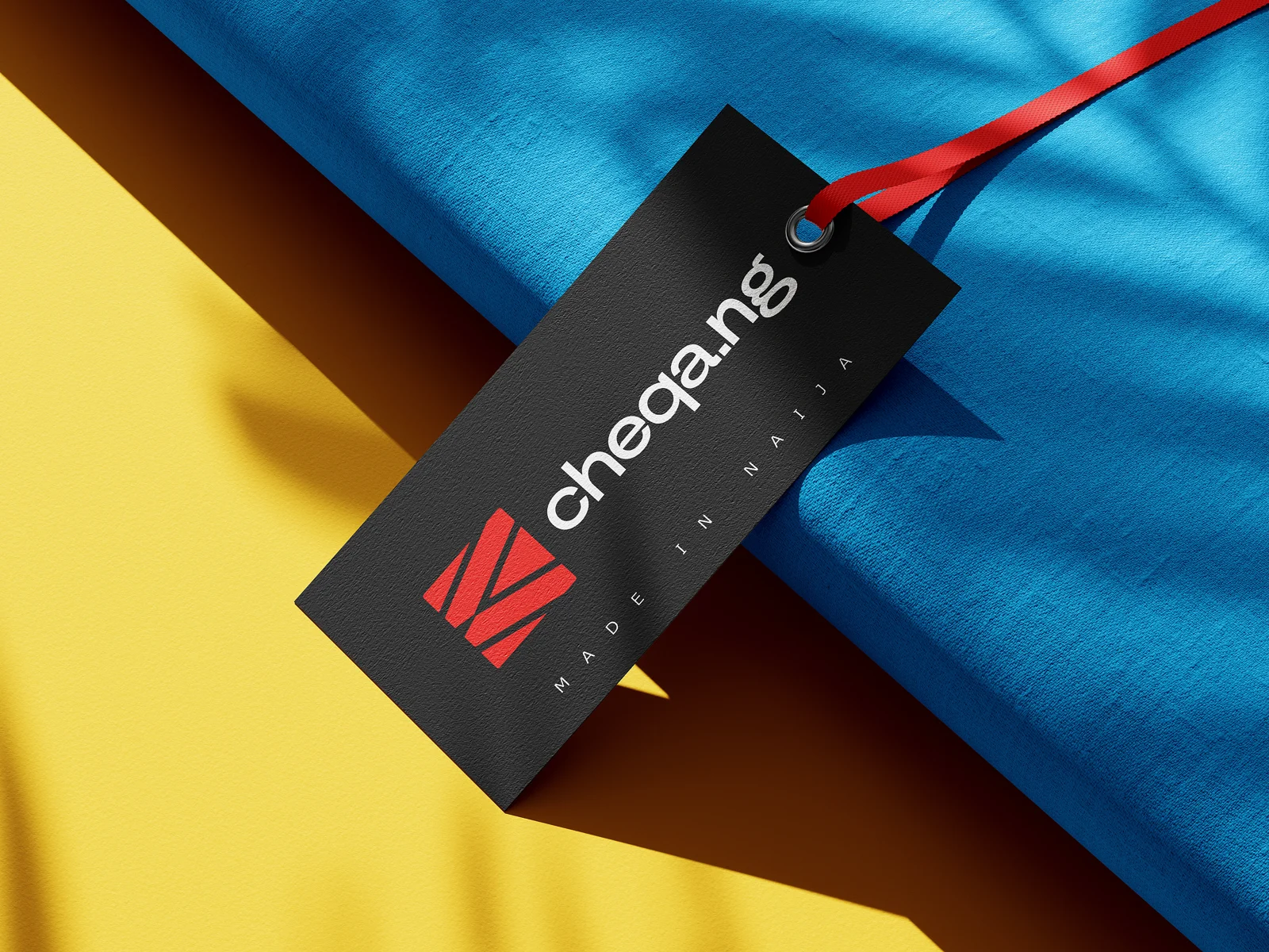
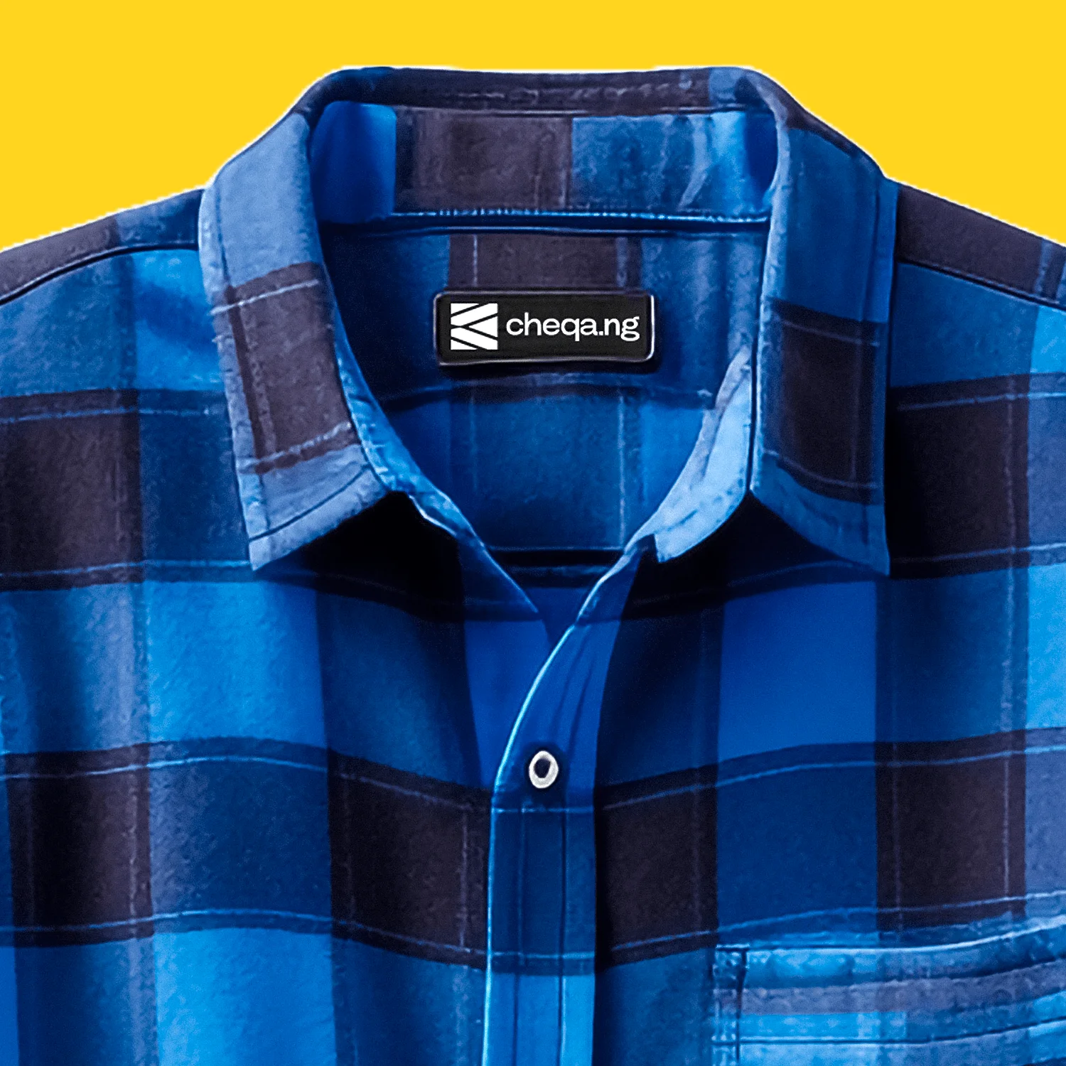
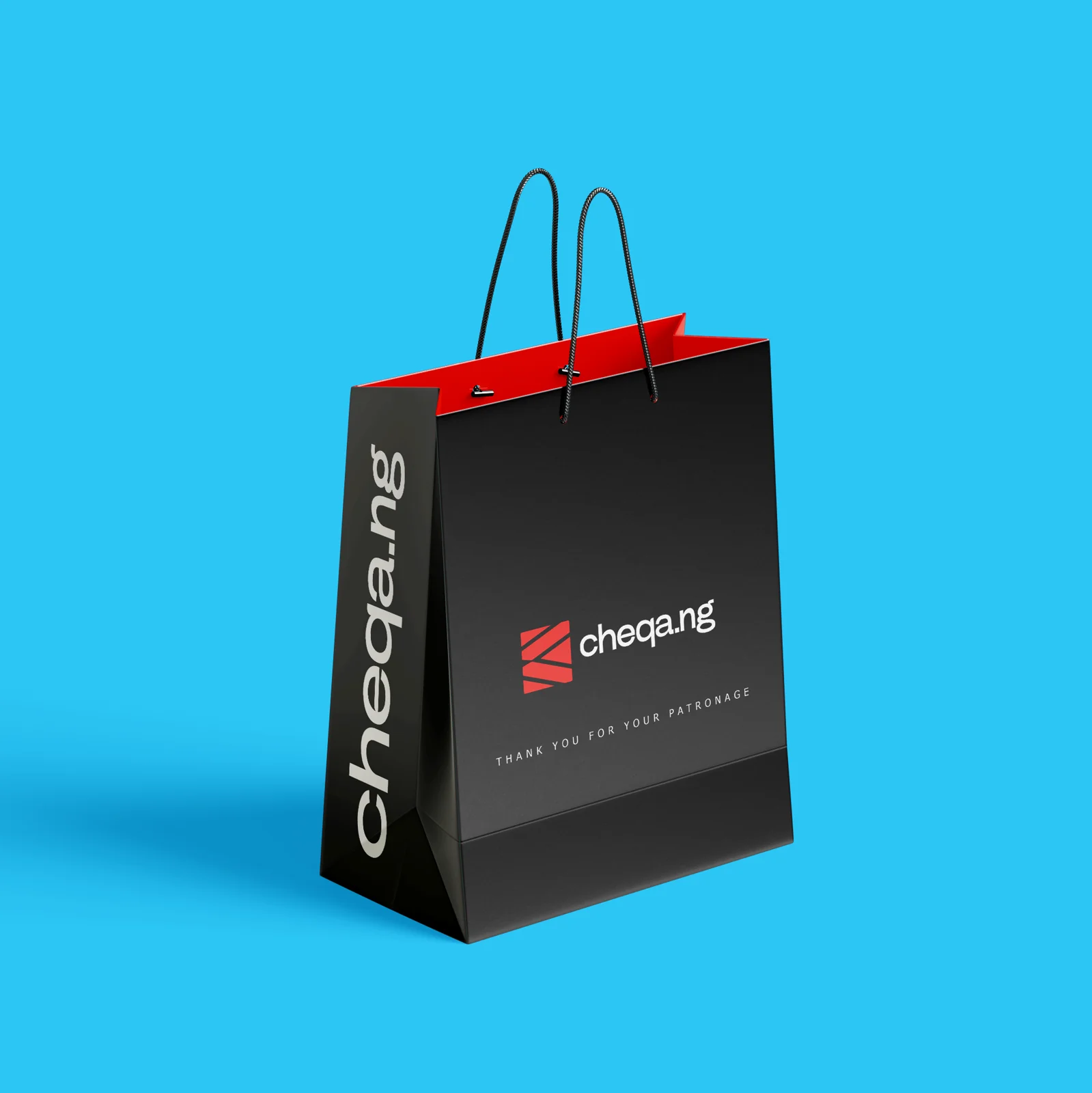
The work extends from garment labels and hats to tote bags, gift packaging and billboard creative. These are brand applications and campaign mockups, not a claim that the business or campaign is live.
A fashion identity made to travel.
Cheqa.ng’s creative direction centres self-expression. The geometric mark and bold colour relationships create a recognisable signature that can move from a small garment label to a large outdoor application.
The human problem
Fashion branding has to survive a change in scale and material. A mark that works on a screen still needs to be recognisable on fabric, packaging and promotional creative.
The identity logic
The angular mark becomes a repeatable pattern, extending recognition beyond the full logo. Red, yellow, black and white offer distinct combinations for different applications. The supplied mockups show how the system behaves on labels, hats and bags.
The application strategy
This engagement covers identity and marketing creative. The billboard treatment tests the identity at a distance; packaging and garment applications test it close up. These applications demonstrate the system before founder activation.
A clear path through the idea.
A simplified explanation of the design logic—not an original production wireframe.
- 01
Recognise the mark
- 02
See the campaign
- 03
Discover the product
- 04
Carry the identity home
Where the work begins.
An emerging fashion idea needed a consistent identity across its future touchpoints.
What the work brings together.
A coordinated set of identity, packaging and campaign applications is ready for the founder’s next phase. The business is not presented as launched.
What success should look like.
These are the signals worth tracking. Verified before-and-after performance figures are not available for this case study.
- Recognition across different applications
- Production legibility at small sizes
- Campaign response once activated

something you.
Tell us what’s not working—or what you want to bring to life.
Bring it here.