
Bloomta
A relationship platform concept with an expressive identity and a considered digital experience.
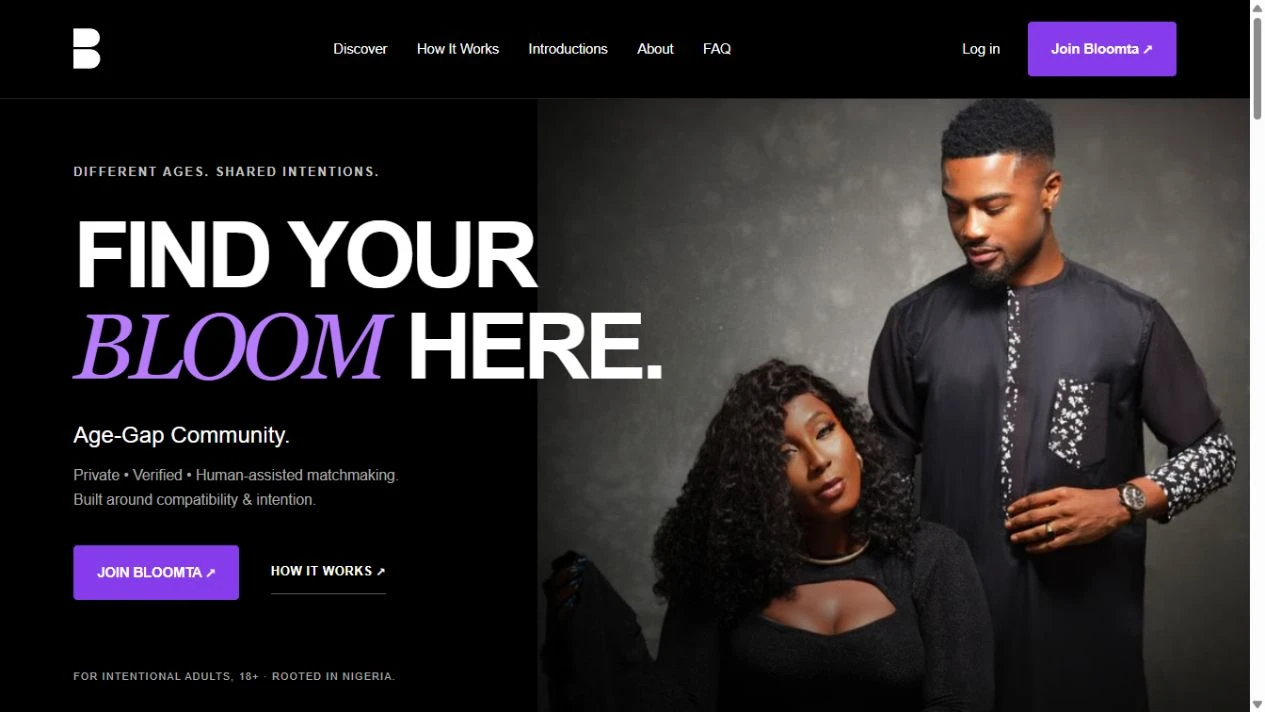
Confidence meets connection
Bloomta explores a different kind of relationship experience. Its website needed to communicate the proposition clearly while giving the brand its own visual personality.
A confident black, white and purple direction provides the foundation for a connected family of pages, from the initial introduction to the platform’s supporting information.
Give connection a distinct point of view.
Bloomta’s digital direction explores a relationship-platform concept with a confident, expressive personality. The creative challenge is to make the proposition understandable before asking visitors to take part.
The human problem
A relationship product has to explain both what it offers and how the experience is meant to feel. An attractive first screen alone cannot do that job.
The identity logic
Black, white and purple establish a clear visual family. Strong type creates hierarchy; repeated interface patterns help supporting pages belong to the same product. The identity aims to balance personality with readable, practical screens.
The digital direction
The interface direction separates introduction, explanation and the next action. Consistent page structure helps visitors understand the offer and move through supporting information without losing context.
A clear path through the idea.
A simplified explanation of the design logic—not an original production wireframe.
- 01
Discover the proposition
- 02
Understand the experience
- 03
Explore supporting information
- 04
Choose the next step
Where the work begins.
A relationship concept can feel abstract when its personality and proposition are presented separately.
What the work brings together.
A connected visual and interface direction brings the concept into a coherent digital presentation.
What success should look like.
These are the signals worth tracking. Verified before-and-after performance figures are not available for this case study.
- Understanding of the proposition in user testing
- Progression to the primary action
- Friction reported during journey testing
something you.
Tell us what’s not working—or what you want to bring to life.
Bring it here.