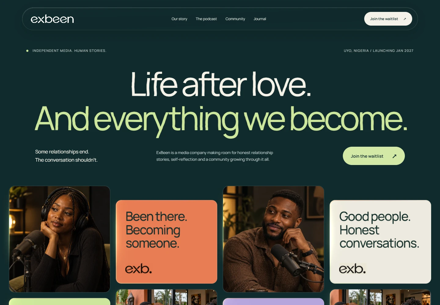
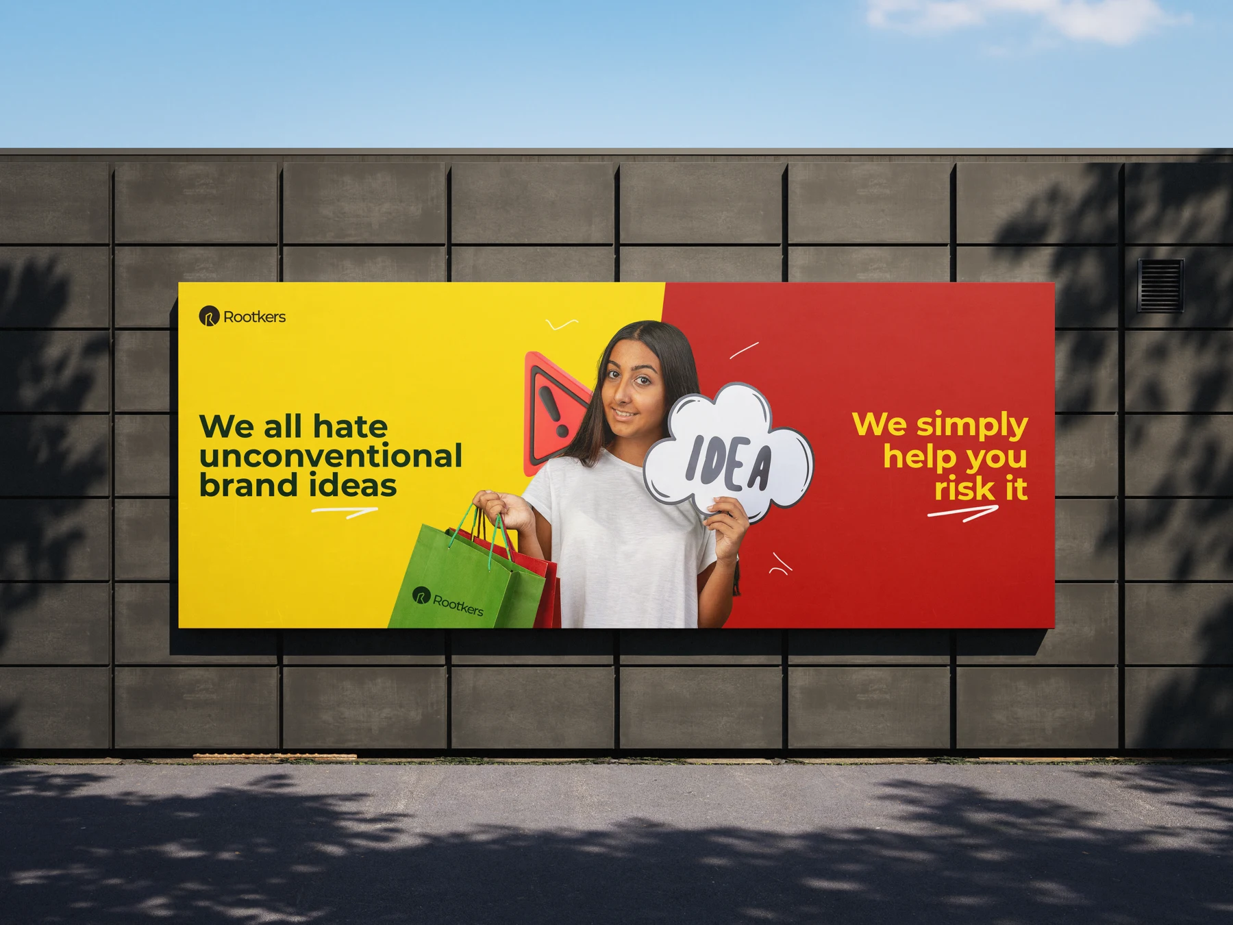
Different surfaces, one point of view.
A billboard has seconds to make sense. A brochure can tell a longer story. A social post arrives between dozens of competing messages. The format changes how much you can say, but it should not change who is speaking.
Design for the distance.
Before resizing a digital graphic for print, think about where it will be seen. Type size, contrast and the amount of information all depend on the viewing context. A composition that works on a phone may need a different hierarchy on a wall.
Give production a place in the conversation.
Paper, finish, material and scale change how an identity feels. Plan those choices while the design is still flexible. Share specifications with the production partner and review proofs before committing to a full run.
Build recognition through repetition.
Repeat the useful details: a distinctive colour relationship, a recognisable type treatment, an image direction or a characteristic tone. Leave enough space for the message to change. A flexible brand system helps new work belong without making every execution identical.