Two small words opened up a much bigger idea.
Ex. Been. Put them together and you get a name that already has something to say. That was the spark for ExBeen: what your experience has been, in relationships and in life. We loved the room inside that idea. An ex can be a person, but a past chapter can also be a place, a version of yourself, or something you thought would last. The name gave us a way into all of it without needing a paragraph to explain itself.
The fun was in giving that idea a personality.
There is a particular pleasure in working with a name that invites you to play. ExBeen gave us that. We could connect a short, memorable wordmark with a much bigger emotional world: reflection, change, connection and becoming. The challenge was to keep the identity approachable. People would be arriving with their own stories; the brand needed enough personality to welcome them and enough space to let them speak.
We gave the words room to breathe.
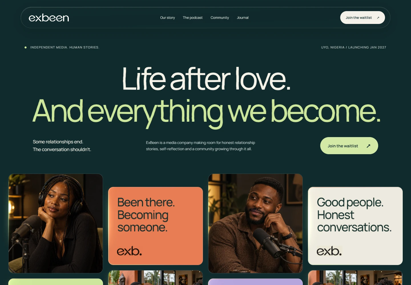
The visual direction pairs expressive typography with a grounded, warm palette. In the website presentation, deep green and softer light tones create contrast without making every element shout. Larger headlines introduce the idea; quieter text carries the detail. We wanted the page to feel conversational, with a clear hierarchy that lets someone understand the invitation before deciding how far to explore. The typography and identity work together to keep ExBeen recognisable as the content changes.
Then we gave the brand somewhere to live.
Our contribution brought brand identity, website design and development into one connected project. The website takes the idea beyond a name and a logo: an introduction, an expressive visual direction, a structure for presenting the brand’s story and a clear next step. We made the identity useful on a real screen, where type, colour, imagery and navigation have to work together. That translation—from a brand idea to something a person can move through—is a part of the work we care deeply about.
What we made sure the work delivered.
The deliverables covered the brand identity, the digital design direction and the website build. Across those pieces, we kept returning to three priorities: make the proposition understandable, make the visual language consistent and give the visitor a clear path forward. The ExBeen case study shows the resulting direction. Anonymous submissions and a podcast are interesting future chapters to document in their own right; we are keeping this story focused on the identity and website work we can show.
Why we think the idea has legs.
We believe ExBeen could give people a useful way to recognise themselves in someone else’s experience. A story that sounds familiar can make a person feel less alone. That possibility is what makes the project exciting to us. We are not calling it a game changer because a screen looks good. We think it has that potential because the idea starts with something human, and the name, identity and website all give that idea a place to grow. Its lasting impact will depend on the people who use it and the care with which it develops.
This is the part we want to keep sharing.
Building in public gives us a reason to open the studio door a little wider. We can show the decisions behind a project, the details that make it feel like itself and the questions that remain after a launch. With ExBeen, the story begins with two small words and the work of turning them into a coherent brand experience. We had fun finding the personality in that idea. Now we are looking forward to seeing what people bring to it.