
Give the visitor a reason to stay.
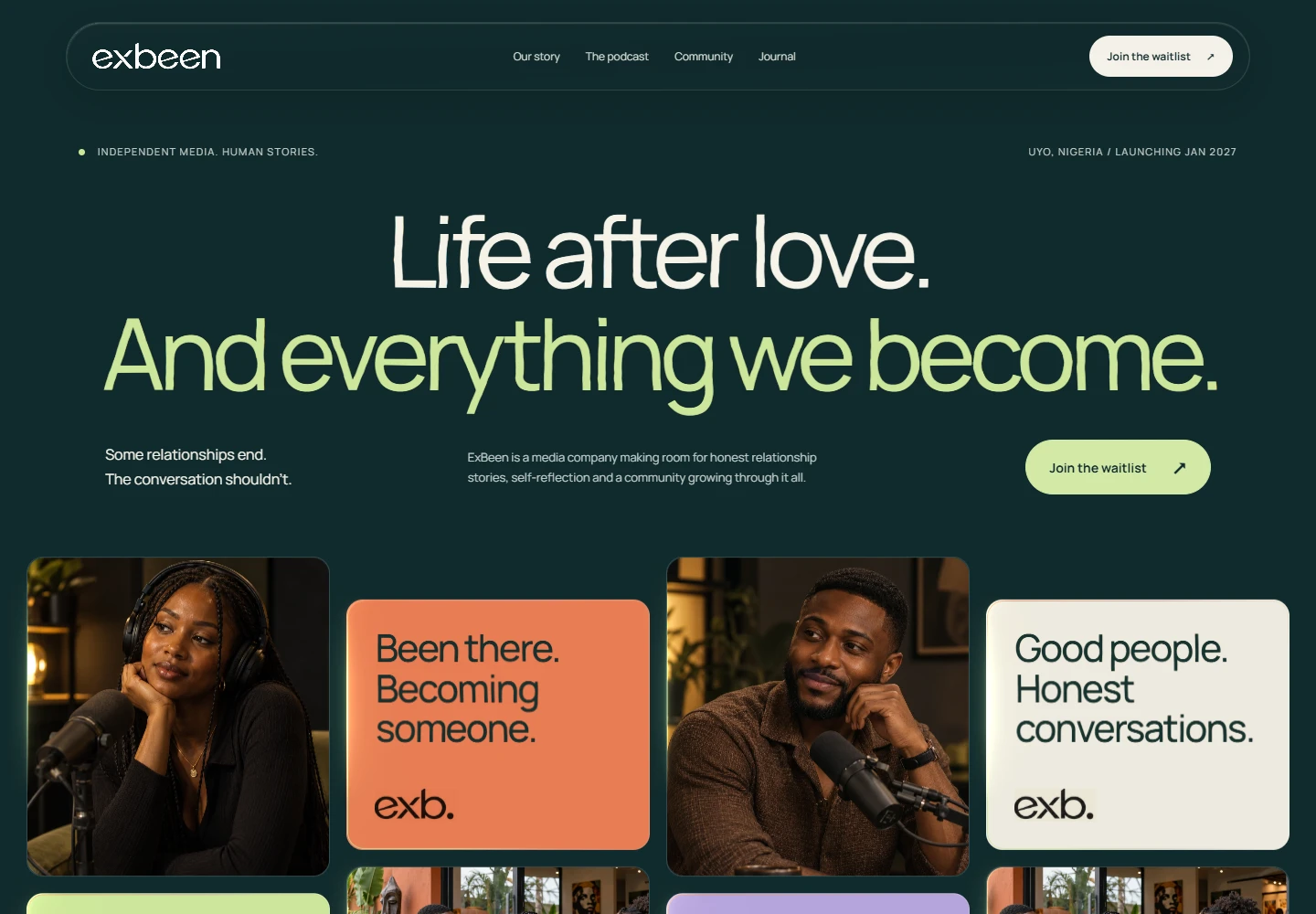
The first screen has a simple responsibility: help someone understand where they are, what you offer and why it might matter to them. An ambitious visual can support that explanation. It should not force people to hunt for it.
Choose the next step.
A service business might want a project enquiry. A portfolio might need a visitor to open a case study. An organisation might want someone to learn about its work. Decide what the page is helping someone do, then make that action easy to find.
Make the small things feel considered.
A button should describe what happens next. A form should ask only for information you need. A mobile menu should close predictably. These decisions rarely become the dramatic image in a presentation, but they shape how the whole experience feels.
Let the work prove the promise.
Show examples that connect to the service you are offering. Explain what the project involved and what you contributed. Use real outcomes when you have them. Useful detail earns more trust than a wall of impressive adjectives.
Keep it alive after launch.
Check the links, update the portfolio and read enquiries for patterns. A website is a working part of a business. The launch gives you a foundation; paying attention helps it stay useful.